

Exploring Data Visualization with Matplotlib

Course Lessons
| S.No | Lesson Title |
|---|---|
| 1 | Introduction |
| 2 | Installing Matplotlib and Prerequisites |
| 3 | Line Plot |
| 4 | Scatter Plot |
| 5 | Plt and Axes Object |
| 6 | Matlab Style Plotting vs Object oriented Plotting |
| 7 | Conclusion |
Introduction
Plotting is an essential part of many data science projects as it can provide insight into the different trends/patterns in data. Data scientists are expected to master a few tools for data visualization which can help in coming up with neat and explainable plots. Out of a large number of plotting libraries available for python the one most commonly used library is matplotlib. In this article, we'll have a look at the different functionalities of this library along with the code snippets for some commonly used data visualization techniques. Let's get started!
Installing Matplotlib and Prerequisites
Matplotlib is one of the most popular and widely used libraries for plotting with python. It was developed by John D. Hunter and introduced for the first time in 2003. He developed it while working on one of his projects where he was required to visualize data using python and there was no library that could have done it in a good way. So he decided to develop an entire library from scratch for plotting in python. The popularity of the library which he developed ("matplotlib") is due to its simplicity and wide range of tools that can be used to create different plots ranging from simple scatter plots to interactive plots. The most frequently used module in matplotlib is 'pyplot' that provides a wide range of functions to easily plot any data. Before we look at the different functions we need to use matplotlib. Following are the code snippets for installation in python or anaconda environment:
#using conda
conda install matplotlib
#using pip
pip install matplotlib
Before we go ahead with matplotlib there are a few prerequisites which include basic knowledge of python dictionaries and lists, as well as some features and functionalities of NumPy and Pandas. Once you get familiar with these things you can go ahead with the rest of the article.
Line Plot
Let's start with a basic line plot.
import matplotlib.pyplot as plt
plt.plot([2,4,5,10])
plt.show()
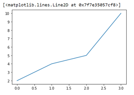
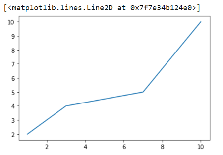
To plot the above graph we have provided 4 values and if you see clearly these 4 values are taken as y-axis values by matplotlib. The x values by default start with 0 and are evenly spaced out with a gap of 1 unit. If you want to pass x vs y you can pass two input lists.
import matplotlib.pyplot as plt

plt.plot([1,3,7,10],[2,4,5,10])
plt.show()
Scatter Plot
Now we'll see how to plot some scatter plots. Scatter plots are commonly used in the field of data science and can provide important information about the patterns in data. We'll use the same function as before but we'll also pass some more arguments such as 'go-' which stands for green dots with the solid lines. We'll not really pass the solid line part as we are making a scatter plot and not a line plot. This leaves us with 'go'. There are a few more commonly used shorthand patterns such as:
- 'r*--' : 'red stars with dashed lines
- 'ks.' : 'black squared with dotted lines' (k stands for black to avoid confusion with blue)
- 'bD-' : 'blue diamond with dash-dot line'
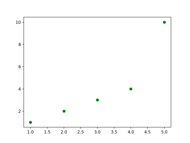
If you want to see a complete list of colors, lifestyles and markers type the "help(plt.plot)" command. Following is the scatter plot with green dots.
import matplotlib.pyplot as plt

plt.plot([1,2,3,4,5],[1,2,3,4,10],'go')
plt.show()
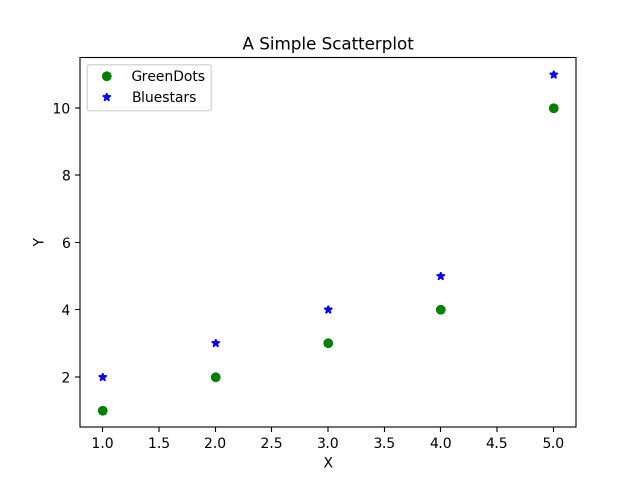
You can also draw scatter plots for two different datasets in the same plot as following. There are a few more additional things we have added in this plot such as the legends, title, and different markers for both the plots. Along with that, the size of the plot is changed by setting figure size inside plt.figure().
import matplotlib.pyplot as plt

plt.figure(figsize=(10,7)) #10 for width and 7 for height
plt.plot([1,2,3,4,5], [1,2,3,4,10], 'go', label='GreenDots') plt.plot([1,2,3,4,5], [2,3,4,5,11], 'b*', label='Bluestars')
plt.title('A Simple Scatterplot')
plt.xlabel('X')
plt.ylabel('Y')
plt.legend(loc='best')  # legend text comes from the plot's label parameter.
plt.show()
Plt and Axes object
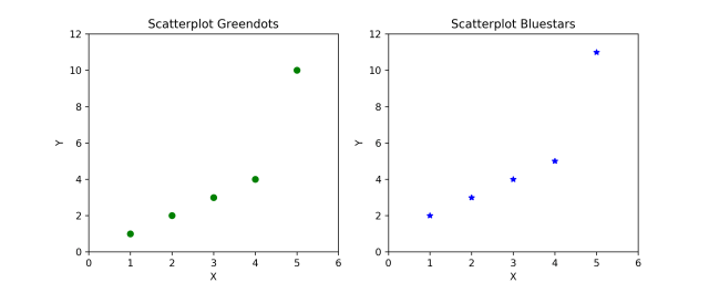
Now that we know how to draw two scatter plots in the same plot. But sometimes due to a large amount of data in one or both datasets the plot becomes untidy and it becomes difficult to find any patterns in the data. In that case, we have to draw two different plots and we can draw them side by side or one beneath the other. The idea is simple, draw two different axes inside a figure using plt.subplots(). This will return two objects which are the figure and the axes (subplots) inside the figure. Have a look at the following figure to have a clearer idea of what it means.
Previously we used plt.plot() as there was only one axis by default but in this case, we'll have multiple axes so we'll use ax.plot() to draw a single plot for each axes.
# Create Figure and Subplots
fig, (ax1, ax2) = plt.subplots(1,2, figsize=(10,4), sharey=True, dpi=120)

# Plot
 ax1.plot([1,2,3,4,5], [1,2,3,4,10], 'go') # greendots
 ax2.plot([1,2,3,4,5], [2,3,4,5,11], 'b*') # bluestart

 # Title, X and Y labels, X and Y Lim
ax1.set_title('Scatterplot Greendots'); ax2.set_title('Scatterplot Bluestars')
ax1.set_xlabel('X'); ax2.set_xlabel('X') # x label
ax1.set_ylabel('Y'); ax2.set_ylabel('Y') # y label
ax1.set_xlim(0, 6) ; ax2.set_xlim(0, 6) # x axis limits
ax1.set_ylim(0, 12); ax2.set_ylim(0, 12) # y axis limits

# ax2.yaxis.set_ticks_position('none')
plt.tight_layout()
plt.show()
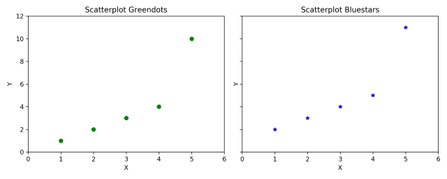
Setting sharey=True in plt.subplots() shares the y axis between the two plots.Increasing dpi=120 increases the number of dots per inch to give a clearer plot. There are many other functions with ax objects like set_title(), set_xlabel, etc which have an equivalent function as their counterparts in plt object.
Matlab Style Plotting vs Object-Oriented Plotting
Another important thing to learn about plotting in matplotlib is that there are generally two types of syntax - matlab and object-oriented syntax. This is the reason behind matplotlib having different approaches to plotting a single plot which sometimes makes it difficult for beginners to understand. The syntax that we have seen so far is Object-oriented and easier to work with.
In the beginning we had told that matplotlib came to life because of some drawbacks in coding in matlab and the main idea of this library was to recreate the plots that are there in matlab. The idea behind matlab syntax is that it keeps track of the current state and whatever is drawn is only visible on the current subplot. In simple terms, the major difference is that in matlab type syntax plotting is done using plt methods and in object-oriented syntax plotting is done using axes methods.
Now we'll try to use both methods to draw some plots. Let's start with matlab type syntax.
plt.figure(figsize=(10,4), dpi=120) # 10 is width, 4 is height

# Left hand side plot
plt.subplot(1,2,1) # (nRows, nColumns, axes number to plot)
 plt.plot([1,2,3,4,5], [1,2,3,4,10], 'go') # green dots
 plt.title('Scatterplot Greendots') plt.xlabel('X'); plt.ylabel('Y')
plt.xlim(0, 6); plt.ylim(0, 12)

# Right hand side plot
plt.subplot(1,2,2)
plt.plot([1,2,3,4,5], [2,3,4,5,11], 'b*') # blue stars
plt.title('Scatterplot Bluestars')
plt.xlabel('X'); plt.ylabel('Y')
plt.xlim(0, 6); plt.ylim(0, 12)
plt.show()
Let's understand each component of the above code one by one. In plt.subplot(1,2,1) the first two values (1,2) correspond to rows (1) and columns (2) and the third parameter (1) corresponds to the position of the current subplot. The plt functions coming after plt.subplot() will always draw on the current subplot.
Now we'll have a look at the OOP approach. At first, the OOP approach may look tougher because it has many components of both axes and plt. But it has a significant advantage over matlab format as the code is not repeated and can be written using loops. This saves unnecessary time spent in coding. Let's have a look at how it works.
# Draw multiple plots using for-loops using object oriented syntax
import numpy as np
from numpy.random import seed, randint
seed(100)

# Create Figure and Subplots
fig, axes = plt.subplots(2,2, figsize=(10,6), sharex=True, sharey=True, dpi=120)

# Define the colors and markers to use
colors = {0:'g', 1:'b', 2:'r', 3:'y'}
markers = {0:'o', 1:'x', 2:'*', 3:'p'}

# Plot each axes
for i, ax in enumerate(axes.ravel()):
    ax.plot(sorted(randint(0,10,10)), sorted(randint(0,10,10)), marker=markers[i], color=colors[i])
    ax.set_title('Ax: ' + str(i))
    ax.yaxis.set_ticks_position('none')

plt.suptitle('Four Subplots in One Figure', verticalalignment='bottom', fontsize=16)
plt.tight_layout()
plt.show()
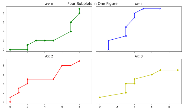
There are no ticks on the y-axis because they were turned off using ax.yaxis.set_ticks_position(). Also, another advantage is that you can refer to any specific component of a plot at any time and then turn off its components from anywhere. The plt.suptitle() adds a main title to the entire figure just like plt.title() would have done for its current subplot axes.
Now we have a really good idea about how to use matplotlib for plotting. The basic ideas discussed here should help with more advanced level functionality with matplotlib.
Conclusion
Matplotlib is at the heart of many other plotting libraries such as seaborn which offers a more modular way of plotting compared to matplotlib. We'll have a look at these libraries in the upcoming articles. Despite all the advantages these libraries have, the biggest edge matplotlib has over them is the fact that it allows for minute details to be changed from scratch and offers more flexibility. This surely helps those who want detailed plots. You can always learn about more functions that can help you in better detailing of plots as well as functions that can help in making interactive plots. Happy Learning!